Reimagining a User Interface, Part 4
Another critical goal for the redesign project was to maximize the size of each displayed information element. The display screens on the Apple Watch are relatively small, which makes it challenging to read textual information during a workout. Maximizing the size and contrast of each textual element helps improve readability during a workout.
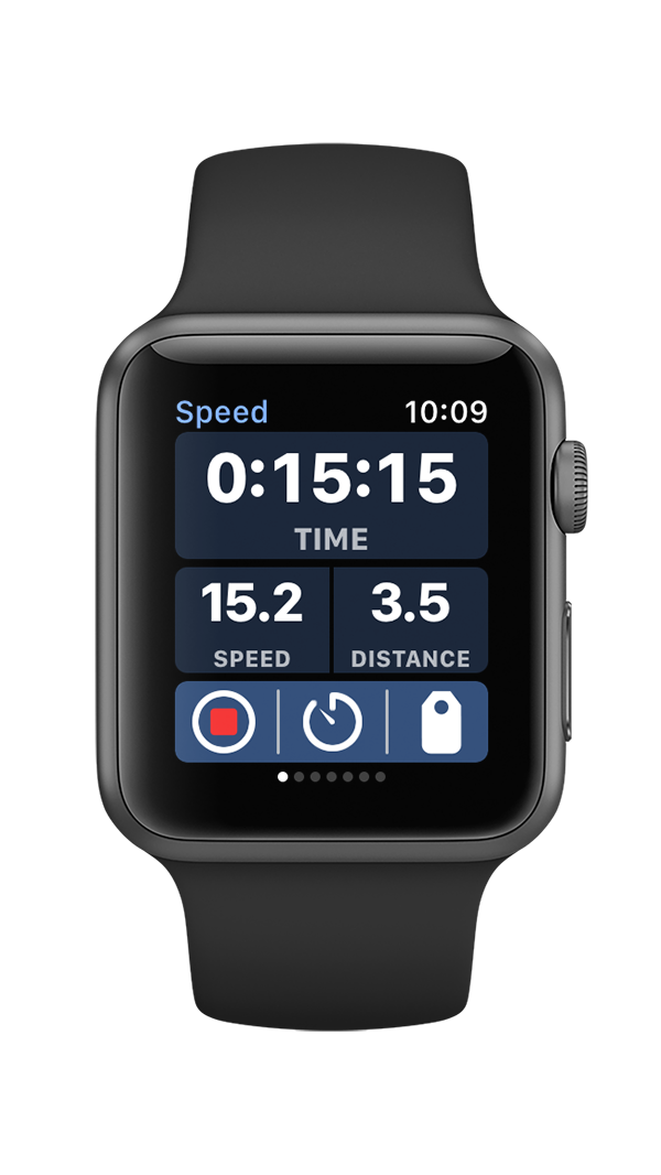
The original WatchOS 1 version of the World Champ Tech workout apps featured a horizontally-scrolling page interface with six data pages. These data pages were accessed by swiping left or right on the screen. The issue with this design is that horizontal page interfaces include a page indicator control on the bottom edge of the screen. This page indictor is relatively small, but it still takes up 12 precious pixels of screen real estate. 12 pixels might not seem like a big number, but its over 5% of the total screen space.
Bike+ WatchOS 1 data screen design with page indicator
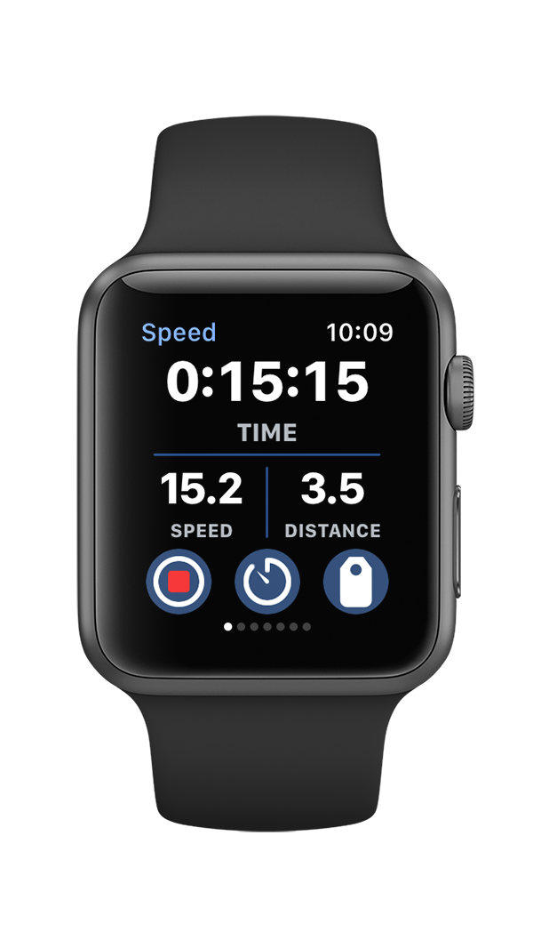
The interface design was changed for the WatchOS 2 version of the app as described in part 2 of this series to increase the contrast of the text. The color backgrounds behind the text were removed and replaced with color 2-pixel separator lines. App testing under a wide range of lighting conditions using various sunglass lens tints indicated that white text on a black background provided the maximum possible readability. Apple notes in their developer guide for maximizing energy efficiency that dark colors help extend battery life since “brighter colors require significantly more energy to display.” This new interface design, which features primarily black pixels, minimizes energy use. Finally, note that the black background seamlessly blends into with the Apple Watch bezel, and helps to create the illusion of an edgeless screen.
Bike+ WatchOS 2 data screen with color data separators
Apple made a different design decision with Apple Watch Workout app, and displayed the time in bright yellow text. The yellow text on a black background is still quite visible under different lighting conditions, but it doesn’t provide quite the same level of contrast as white text on a black background (yellow text is particularly hard to read through blue-tinted swim googles while under water during a swim workout). Additionally, by squeezing five vertical data elements on one screen, the font size for the text had to be reduced to accommodate all of the data. Also, squeezing five data elements onto one screen forced Apple’s design team to squeeze out any spacing between the text elements. The final design might look reasonable when presented in a lab during a design review, but the small text and lack of spacing makes it well near impossible to read during a workout.
Apple Watch Workout app data screen.
An additional problem with both these designs is the same issue with buttons described in part 2 of this series: the swipe gestures to change pages struggle to work well when the screen is wet from rain or perspiration. One option to address that would be to develop a new control gesture that would still perform reliably even with a wet screen. Starting with WatchOS 3, Apple allowed developers to use the Digital Crown button on the side of the Watch for input. Rotating the Digital Crown to switch between data screens presented an attractive option to address the shortcomings of swipe gestures on a wet screen.
The challenge from a design perspective was that the page interface was horizontal, while the Digital Crown with up and down rotations seemed naturally designed for a vertical interface. Fortunately, Apple allowed for vertical page interface designs, and as a curious quirk, didn’t display a page indicator for vertical page interfaces. By switching to a vertical page interface, the page indicator would magically disappear, and allow for an additional 12 pixels dedicated to data which allowed for slightly large fonts, and increased space between each data element. The maximized font size, and large spacing between text data elements provided the best possible readability when testing the app during actual workouts.
Run+ time data screen without page indicator
This leads to a key insight derived from the redesign of the World Champ Tech Apple Watch workout app user interface: to really evaluate the design you need to test it at the end of a long, hard workout where you are tired, out of breath, and drenched in perspiration. An interface that looks good in a lab simply might fail to perform well in real world conditions. The World Champ Tech Apple Watch workout apps were tested for years during all types of workouts to develop an optimal workout app experience.
Run+ pace data screen with three data fields


