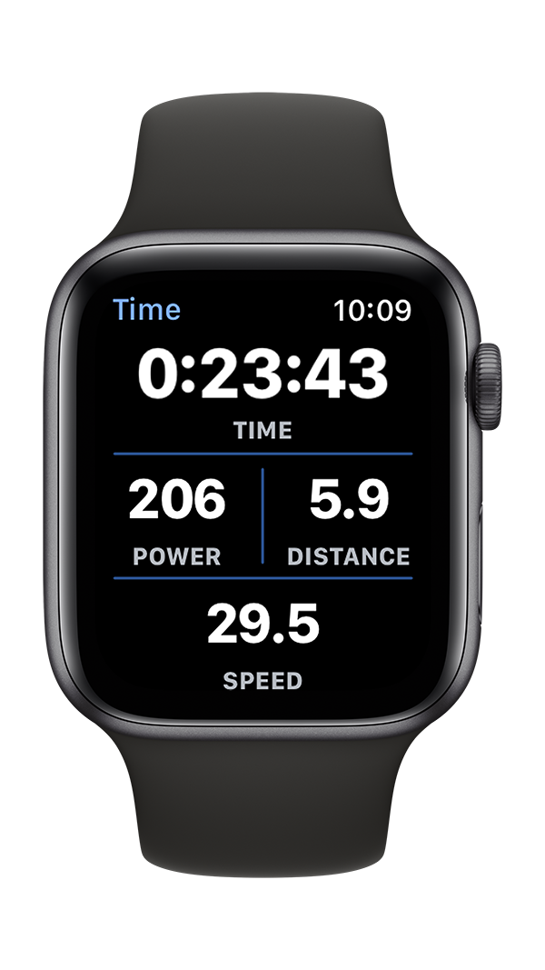
Reimagining a User Interface, Part 3
One significant goal for the World Champ Tech workout apps user interface redesign was to improve the function of the control buttons to toggle workouts and intervals. The Apple Watch screen has a significant issue: buttons don’t work terribly well when the screen is wet from perspiration or rain. You might need to tap multiple times to stop a recording at the end of a long, hot run when your hands and fingers are drenched in sweat. That’s a frustrating difference from traditional stop watches that have mechanical buttons to provide positive control over the timer. Tapping multiple times to stop a recording makes it impossible to get precise workout times.
This post explore the design evolution of the World Champ Tech control interface from the initial WatchOS 1 version through the new interface design for WatchOS 7.
Apple Watch Workout app control buttons
The original interface design for World Champ Tech’s Apple Watch workout apps placed the control buttons on the main workout data screen. The seemed like a reasonable option given the limitations of WatchOS version 1. WatchOS 1 had limited user interface controls to choose from, and buttons were one of the few toggle controls available to designers and programmers. This design featured dark colored backgrounds behind the data elements, and a slightly lighter colored background behind the buttons to highlight and distinguish the controls from the data.
Bike+ interface design for WatchOS 1
With the introduction of WatchOS 2, the interface for the World Champ Tech workout apps was updated to increase the visibility and clarity of the data. The solid color backgrounds were replaced in favor of simple colored separators. Extensive testing in different lighting conditions showed that a design featuring simple white text on a black background was more readable through a range of sunglass tints, and light levels. The buttons were set to stand out from the data by creating round, colored backgrounds to identify them as control buttons.
Bike+ interface design for WatchOS 2
This design suffered from some significant problems: fitting the buttons on screen necessitated a small button size, and the tap-gesture actuated buttons still struggled to function when the screen was wet. Fortunately, Apple had introduced new context menus with WatchOS 2, and these context menus provided a new way to add buttons to the app. Designers could add a hidden context menu to any interface controller screen that would display after a long press, or force touch gesture anywhere on the screen.
Bike+ main data screen with hidden controls menu
Bike+ context menu with record & interval controls
Testing of the context menus lead to a big eureka moment: the long press or force touch gestures worked a lot better than mere button tap gestures for reliably trigging controls when the Watch display was wet! The performance of standard buttons is hit or miss, and it often takes multiple taps to trigger a button on a wet screen. Long press or force touch buttons seem to work every time - even on a wet screen.
There was only one problem…Apple decided to deprecate the menus starting with WatchOS 7. As Apple noted in their human interface guidelines, or HIG, “in versions of watchOS before watchOS 7, people could press firmly on the display to open a hidden menu of actions relevant to the current screen. In watchOS 7 and later, watchOS apps elevate important items out of such menus and into the relevant screen or a settings screen.” Apple recommended removing hidden menus from Watch apps.
Elevating important data and controls buttons out of hidden menus is a laudable goal, but the wet screen performance of traditional buttons was so deficient that this choice would have a significantly negative impact on the user experience of workout apps. If you are working out, you are probably going to get sweaty, and that perspiration is going to make standard buttons perform inconsistently. We solved this issue by creating custom buttons that could be triggered either with a button tap or long press gesture. The controls screen could be accessed like a context menu from any data screen through a long press gesture, or by scrolling a screen up from the time data screen.
Final Bike+ design with custom menu buttons


